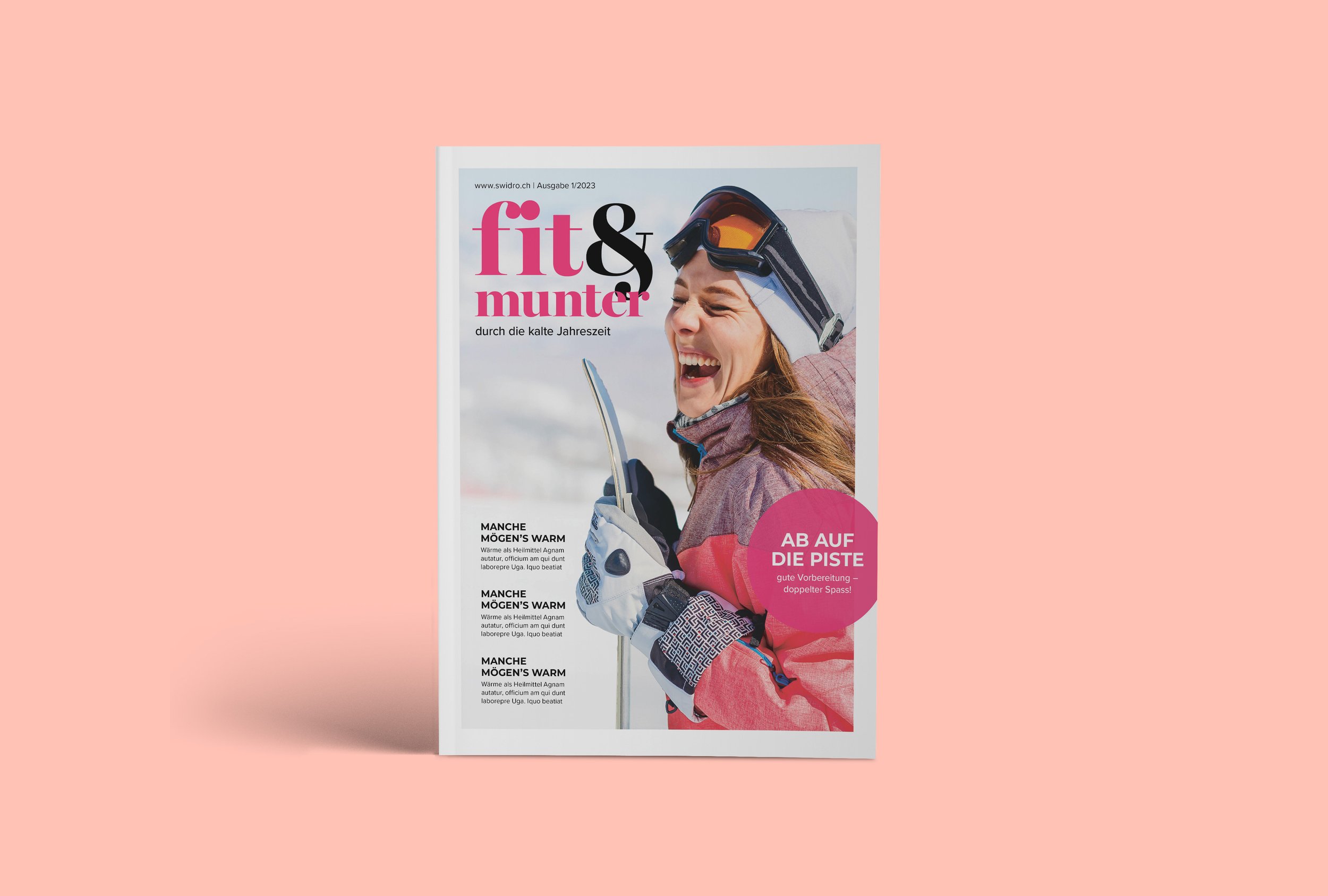
Fit&Munter Magazine
For Fit&Munter, the transformation from its previous iteration was profound. The magazine's former design leaned heavily into medicinal themes, adopting a tone that bordered on overly negative and aggressively sales-driven. Pictures often depicted aging individuals in states of distress, perpetuating a somber and literal narrative, particularly in articles about illness.
To counter this, my approach centered on infusing the publication with positivity and modernity. By leveraging uplifting imagery and contemporary typefaces, alongside a vibrant color palette, the magazine underwent a remarkable metamorphosis.


Color Selection: The choice of pink and black wasn't arbitrary; it represented a deliberate departure from the clinical and stark aesthetics of the past. Pink, symbolizing femininity across generations, was juxtaposed with black for an edgy, modern twist. Together, they formed a harmonious blend that exuded both warmth and sophistication, resonating with the magazine's diverse readership.
Typography: The fusion of serif and sans serif fonts was more than a stylistic choice; it was a deliberate effort to strike a balance between tradition and innovation. The Miller Banner family, with its graceful curves and classic appeal, evoked a sense of sophistication and timelessness, while Montserrat brought a contemporary edge, reflecting the magazine's modern outlook.
Tone and Imagery: Gone were the bleak visuals of yesteryears, replaced instead by scenes of vitality and joy. The magazine embraced a more inclusive and aspirational ethos, fostering a connection with audiences across generations. Uplifting imagery captured the essence of active living, portraying moments of joy, connection, and vitality. This shift in narrative wasn't merely cosmetic; it represented a fundamental reimagining of Fit&Munter's identity, resonating with readers on a deeper, more emotional level.


