IdeaFund - Digital Campaign Case Study for Revolut
This is a case study for Revolut’s new product: IdeaFund. IdeaFund is a crowdsourcing product and I created a digital campaign concept to promote it.
Initial Thoughts
IdeaFund Digital Campaign
After getting the brief, I read it quickly to see whether I can get the general idea. Then as I read it again, I rewrite it as well to make sure that I’m not missing any crucial details.
While rewriting, I make a note immediately upon terms that I don’t know yet, highlighting some keywords that I think is important, as well as making more notes of whatever come into my head upon reading it.
Research
Crowdfunding is...
Basically raising money online from people, there is an idea of community.
Existing platfroms?
I found a lot of famous one, so I took a note as well as what each platfrom are well-known for. Also, I search for whether other bank has come up with crowdfunding products or not, none that I can find interesting so far.
After listing some of them, I narrowed them down to three for further research. These three I picked up based on the similarity of their target market with IdeaFund; young professional, creatives, urban people.
Revolut’s existing style
I think of the campaign as a sibling with others but a better sibling, but not so big like the oldest sibling that is the brand campaign.
So it’s important for me to see around what Revolut has been doing so far. I make note the style, layout, what kind of images being used, etc. How’s their brand campaign so far.
Also, I noticed the type of animation Revolut uses for it’s text-based content.
Target market
At the beginning, I thought about dividing the investors and founders. As both can be potential new customers. In the end, I decide to focus on founders, as targeting future investors can be done with other Revolut’s products (such as bitcoin, insurance, etc.)
Other platforms also targeted the Founders mostly despite some differs in their channels.
I elaborate more on how they think, what they want, etc, their characteristics.
KPI
Noted that the goal of the campaign that is to have higher download, high turning point.
I translated this into the need of having a strong CTA. Strong message that linked into the CTA as solution.
At the same time, visually, it has to be strongly distinctive/contrasting.
Competitor research
This step is essential to see what the market expectation is. It is also useful as well to see how can we can position IdeaFund among these platforms if not higher.
The things to be noted: What are people used to seeing when it comes to crowdfunding campaign? How does it visually look? The assets, the style, What is the messages, what are the channels used, and whether the competitors differentiate way of communication between platform or not.
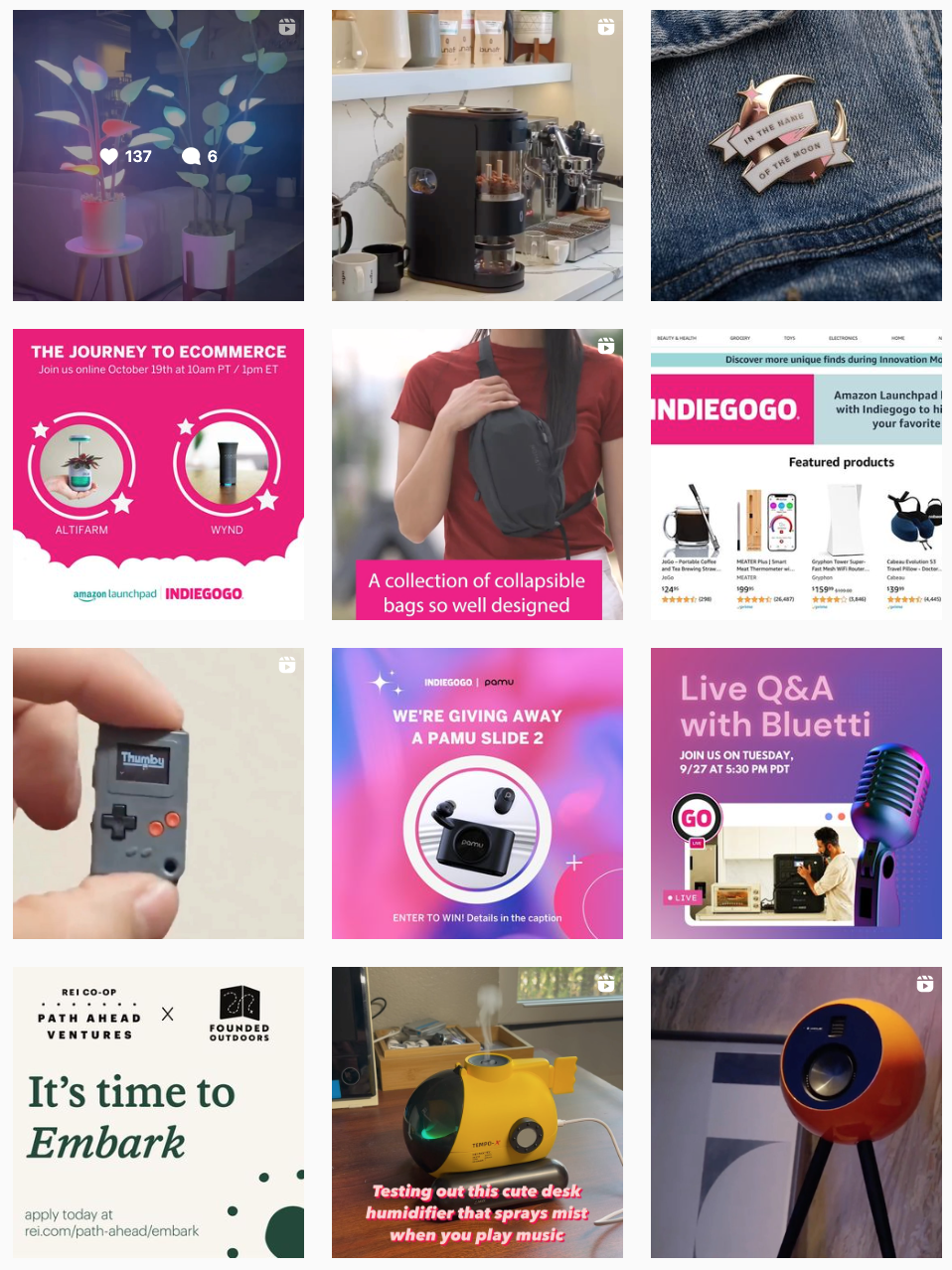
I observed what these 3 companies/platforms has been doing throughout their social platforms (Youtube, Instagram, Twitter, and Facebook). Taking a note of things that I find interesting, and then in the end make some summary out of it.
1. Kickstarter
Famous for creative projects
When opening their website, the tagline was very catchy with a strong CTA. I make a note of this for the campaign later.
Their communication is the same throughout all channels. - Consistency
They use story of each founders as content, it gives personalization. I can see how it attracts both investors and other founders.
2. Indiegogo
Really more for techy founders.
Too some extend some of the content has Steve Jobs vibe.
Strong emphasis on educational content supporting the founders - The way they promote their platform. Such as long talk video.
e-commerce vibe. -> Product oriented instead of people.
Different communication through some channels.
Overall I think their approach is rather different that what IdeaFund will be.
3. Patreon
Crowdsourcing through subscription. Different business model than the others.
Target market is for creatives and can be seen throughout its brand.
Different communication through different channels - different content. In some channels, Patreon speak as a first person - highlighting its branding, and in other channels it promotes its creators.
Content are mostly artsy, illustration, 3D, simple. Trendy but trendsetter in a way.
Concept Development
Campaign ideas
After all the research, I have to collect all the data in a simple way, one of the way to do it is narrowing them down to Keywords.
At the same time, I make mental notes that the campaign should be a mix of videos (with people in it) and typography.
Having people in the content, humanized the brand as seen as in other platforms, which highly emphasize their campaign on the story of its creators (people).
Then I thought about the messaging, what are the crucial elements needed to be communicated. Here’s where those Value prop are highlighted.
Needless to say, I came up with a lot of cringey lines before getting to lines that I’m satisfied with. I spend some time as well thinking about the CTA, bearing in mind that is an important factor for KPI.
Visual Look
While still buiding up correct message, I search for footages, images, according to the keywords I already have.
I came up with some concepts. They range from being very literal to being too conceptual, too common (expected) vs too weird.
For the feel of the campaign: energetic or calm, youthful or professional? Some of the literal ideas are the city skylight, the escalator going up, people in a cafe in the city. With these ideas, I find it rather too expected.
For ‘One person shot’ concept, I thought I can put a person looking at the camera being told about revolut’s new product, and have her facial expression be the answer. However, I find that having 1 person be the representative of the target market will risk having the campaign getting too niched.
I also thought about perhaps putting some creative people with their profession such as crafter, musicians, dancers, as they’re all young creatives. However, these also feels too specific, and depending on the assets I can find, either too young or too old.
Then I become more conceptual. I thought about Running, where I thought that life is a journey, a marathon, so the beginning of the race is like the early stage of funding. However I’m still confused how to make this still understandable materials, i.e. it’s not Nike or sport ads.
After going back and forth, with all of these, I finally settle for ‘the’ concept.
Final Concept
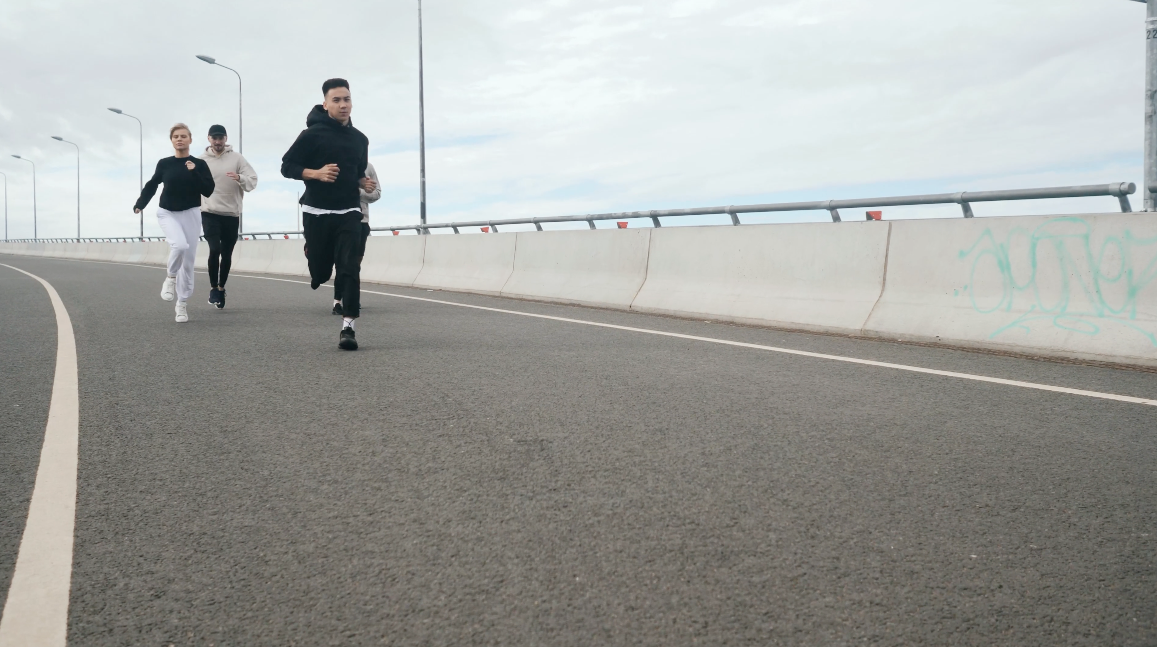
The concept that I go with is (*drumrolls*) “RUNNING”.
I find this concept is the best to describe all the keywords. It embodies energy, youthfulness, element of fast, quick as well as purpose/goal. Within this concept, I can also play around by adding more detail to communicate all the aspects.
I created a story. The story is a young person in a city, starting his/her journey (running), and as she started running, more and more people joining her together.
Background music:
I know I wanted something upbeat, youthful, positive, and modern. After listening to some samples, I chose the one that gave such feelings but additional resistance that give an uneasy feeling. I find it suitable for the tagline “Life isn’t easy”
Animation:
The text animation is following other Revolut’s assets - text appearing from bottom up.
Storyboard
-
Bird eye city shot
-
No Text
-
Cities as background -> highlighting the urban life.
-
A pair of foot starting to run in the city
-
Starting
-
Starting to run simbolizes the beginning of a journey -> the beginning of your business, and starting to ask for early-stage funding.
-
2 pairs of feet running
-
needs the fastest help
-
2 people run together symbolizes early stage help
-
People running together towards a direction
-
with instant access to
1 Million
active investors -
Lots of people running together -> togetherness, community -> crowdfunding -> 1 Million investors ready to help
-
The same people but from back angle - unity
-
no worries for
legal matters -
Still with togetherness, helping each other, needing no worry for other matters
-
Lots of people running
Brand blue color
-
Idea Fund
Revolut’s new product
-
Product scene introduction with Revolut’s brand colour. Showing customers what product and which brand this is.
-
People running together from front shot
-
Starting isn’t easy but it can be simple
CTA: Get the app
-
End scene shows the conclusion with the tag line that invites customer to get the solution of having simple start that is get the App (CTA).
Deliverables
Video deliverables
I created a full version video - 25s at first. From this big piece, I then move into 15s version, cutting only a few scenes. As for adapting to different dimension, I only need to change the placement of the text.
Static Carousel
I find that carousel can better explain the campaign, so I created one as well. It took some of the scenes, focusing more on the value prop text.
Static deliverables
To keep it coherent as one campaign, I use image of people running together with the tagline and CTA.
In all assets (for video as well), I put the CTA as contrasting as possible for that ‘eye grabbing’ impact.
for 1:1 and 4:5, I use the same image, meanwhile for the 19.1:1 size, I use a different image as it fits the composition better.
Further Thoughts
Overall, I am happy and satisfied with the result. I especially love the process of researching and educating myself more about the industry before developing the concept.
Furthermore, apart from the assets that has been created, a special landing page can be created about IdeaFund, so people can have a better understanding about the crowdfunding ideas. All the paid channels can link towards it before asking people to download the App directly.


